ANL501 Data Visualisation and Storytelling
View the Project on GitHub nicholas-sim/ANL501-Data-Visualisation-and-Storytelling
Seminar 5
This seminar first discusses the importance of data preprocessing for data visualizations. Data preprocessing, which includes feature engineering and data reshaping, could be necessary to construct visualizations that convey a specific data story that cannot be achieved otherwise with standard ggplot functions. Following which, we explore visualizations that facilitate the comparison of distributions across groups, such as boxplots, dotplots, jitter plots, ridge plots, as well as treemaps, which display rankings and hierarchical structures in a variable. We then consider employing text elements, such as labels and annotations, to improve storytelling in data visualizations. Finally, we explore the visualization of geospatial data through chloropelth maps, which where regions or areas on the map are colored in proportion to the values of a variable of interest.
Column Plot and Data Processing
Table data consists of summarized information presented in tabular format. This discussion delves into visualizing table data through column plots. It explores how bar charts with specific bar placements, which cannot be directly achieved using standard ggplot functions, can be created by first preprocessing the raw data into a table format and then utilizing the column plot for construction. Additionally, it underscores the importance of data preprocessing, especially in achieving specific visualizations through feature engineering and data reshaping. Finally, the discussion concludes with an overview of integrating Python libraries into R using the reticulate package.
Plotting Distributions for Comparisons: Boxplots, Dotplots and Tree Maps
This discussion focuses on data visualizations that compare distributions across groups. These visualizations include boxplots, which provide visualizations of key summary statistics of a numerical variable, dotplots and jitter plots, which employ points to show incidences of a variable, among others. The discussion concludes with a brief discussion of treemaps, which are useful for showing the rankings or hierarchical structures of attributes within a variable.
Improving Data Storytelling: Labels and Annotations
Labels and annotations can be used to clarify certain features in a data visualization. For instance, labels can be used to identify important points in a scatter plot, while annotations can be used to mark areas corresponding to recessionary periods in time series plot, or as text to highlight important events captured by a data visualization. We explore how labels and annotations can be included to strengthen the data storytelling elements in data visualizations.
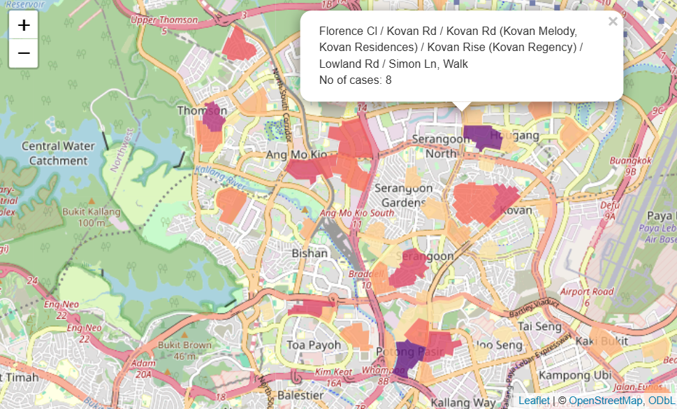
A choropleth map is a thematic map where regions or areas are shaded or colored based on the values of a particular variable. This type of map is valuable for visualizing the spatial distribution of data, such as GDP per capita across countries or voting patterns across states. To create an effective choropleth map, it is important to understand the structure of map data and how to properly format it. We begin by discussing map data and how it is organized, and then take a deep dive into the essential aesthetics of geom_polygon for constructing boundaries that delineate areas or regions. The discussion concludes with a brief discussion on the utilization of simple features data frames and how we may construct choropleth maps using them.